Terraviva competitions
ACTIVITIES
- Brand Identity Design
- Logo Design & Development
- Visual System Creation
- Color Palette & Typography
- Brand Guidelines
- Brand Applications
DESCRIPTION Comprehensive brand guidelines for Termoli, a coastal city rich in authenticity, traditions, and everyday life. The project builds a clear and distinctive visual identity that reflects the soul of Termoli: its authenticity, hospitality, and connection to the sea.
A city that needed its identity made visible.
Termoli blends the beauty of its old town and seafront with a vibrant community proud of its roots. More than a tourist destination, it represents the Adriatic spirit: warm, accessible, and rooted in history.
The rebranding was about making that identity legible, visible, memorable, and consistent across every surface it appears on.
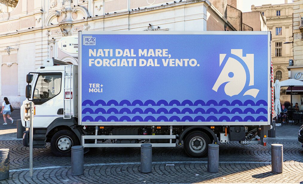
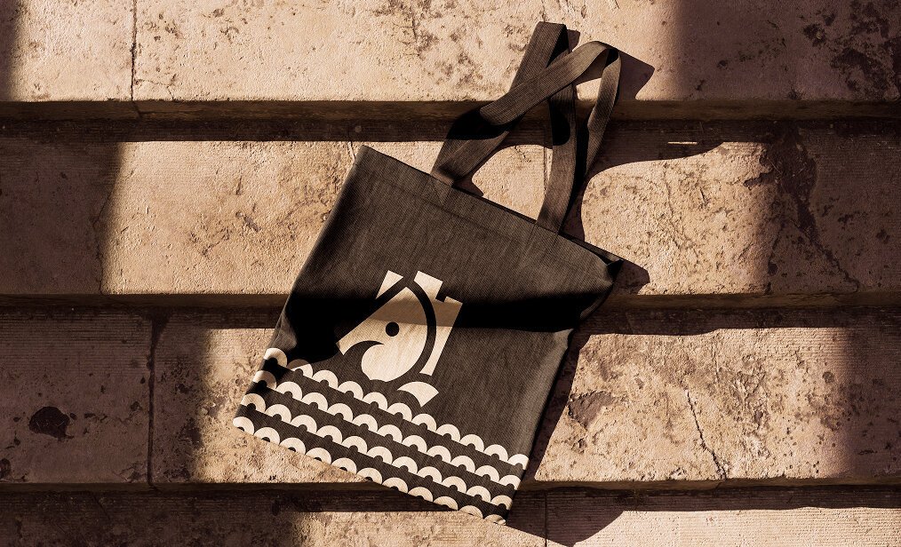
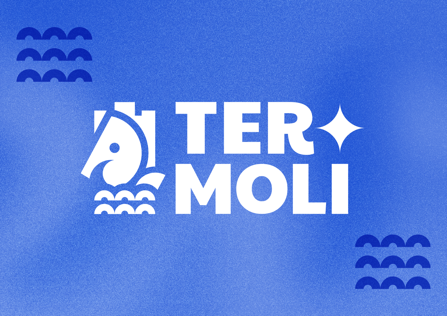
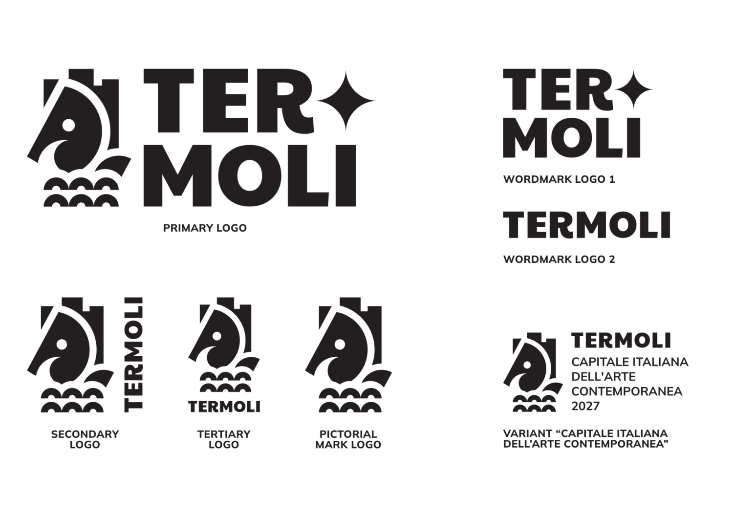
Two symbols, one city.
The seahorse, symbol of Termoli's sports teams, carries the city's connection to the sea: a sign of luck, strength, and local pride. The Svevo Castle, a bold 13th-century fortress, tells the story of Termoli's medieval strength and heritage.
These two icons became the foundation of the logo, giving it depth and meaning beyond decoration.


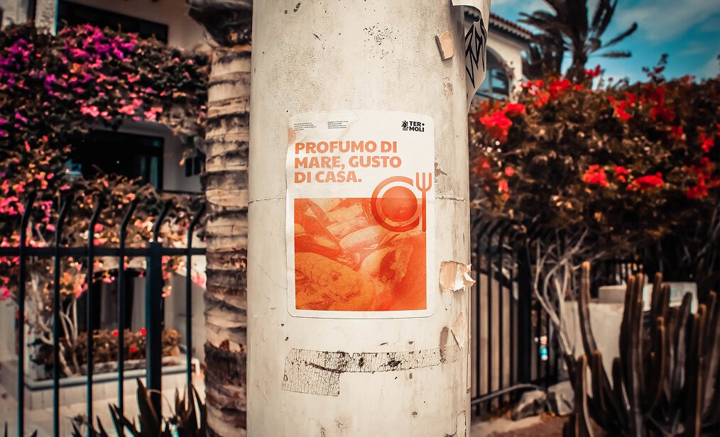
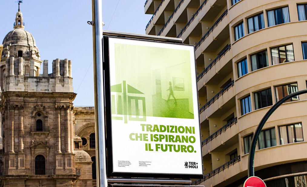
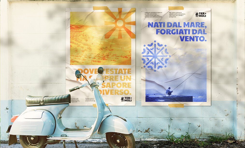
A color system built around the city's themes.
Six themed categories, each with its own palette. Maritime Identity uses Royal Blue and Soft Sky Blue for the sea. Historic Center uses Sunset and Peach Cream for the old town's stone and warmth.
Each palette is designed to work independently or together, keeping the system flexible without losing coherence.


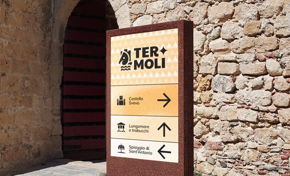
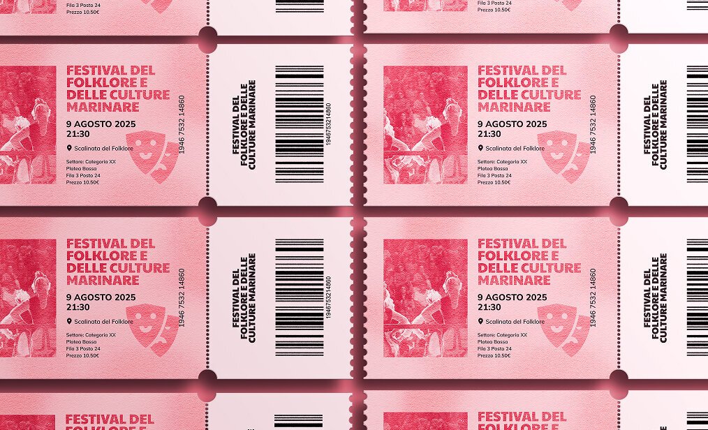
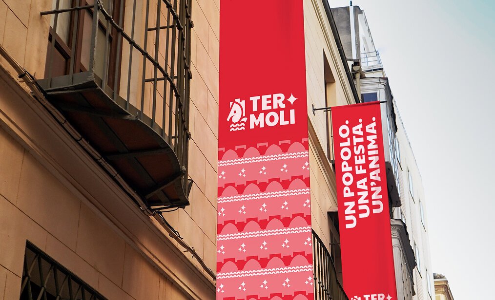
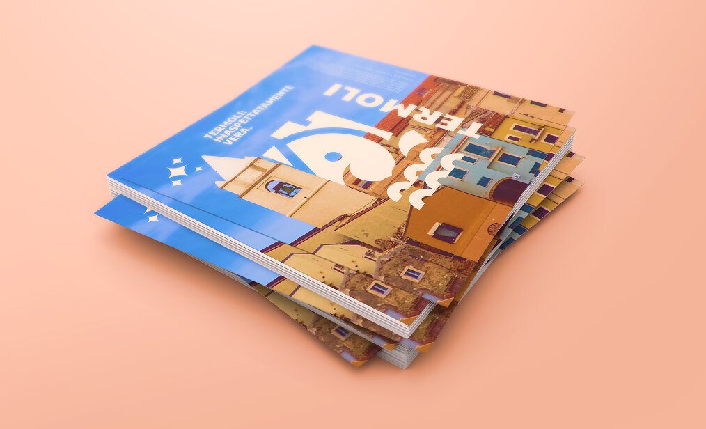
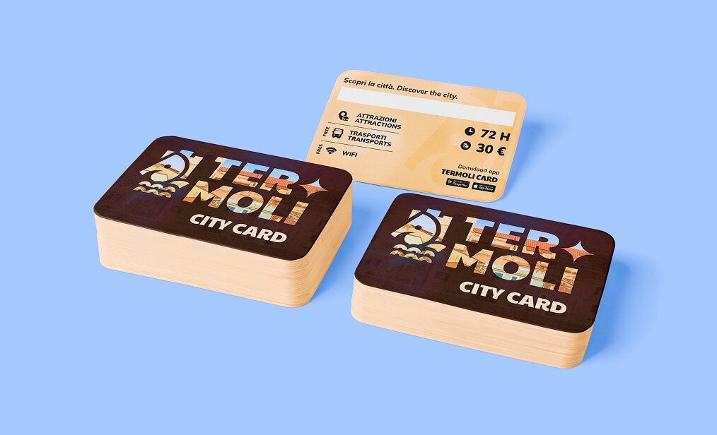
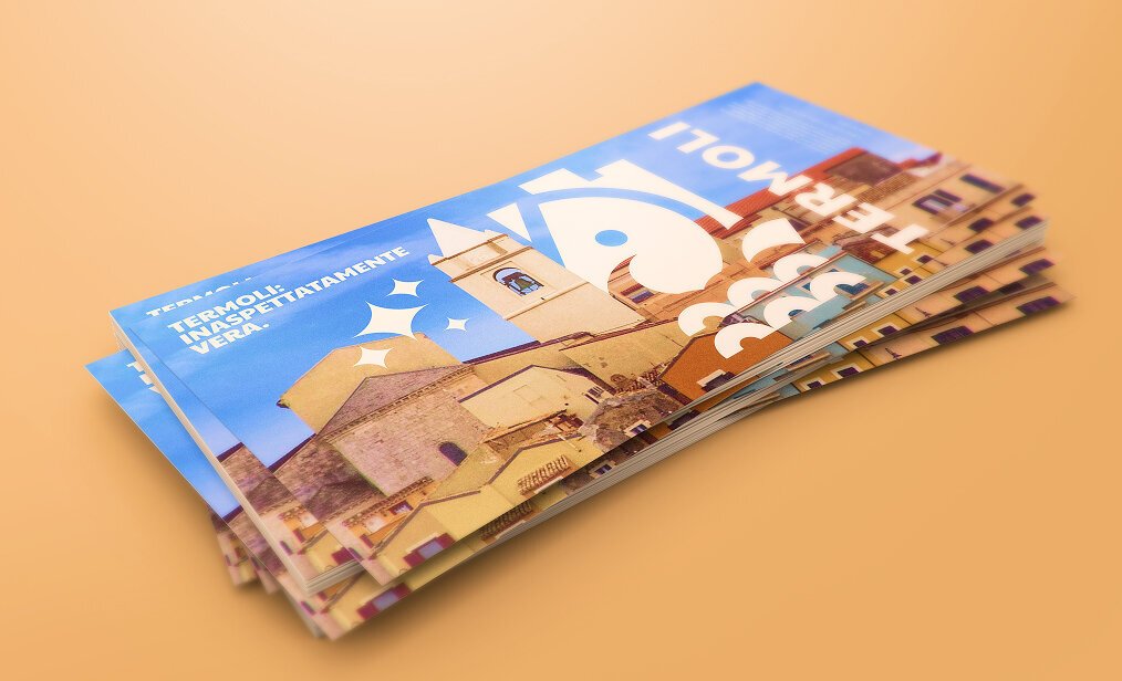
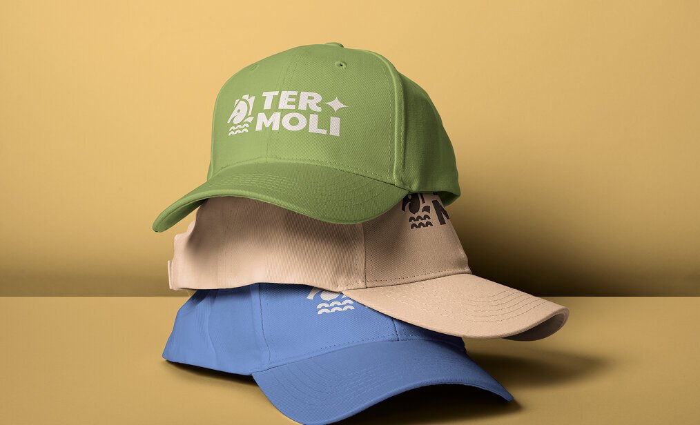
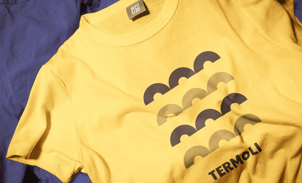
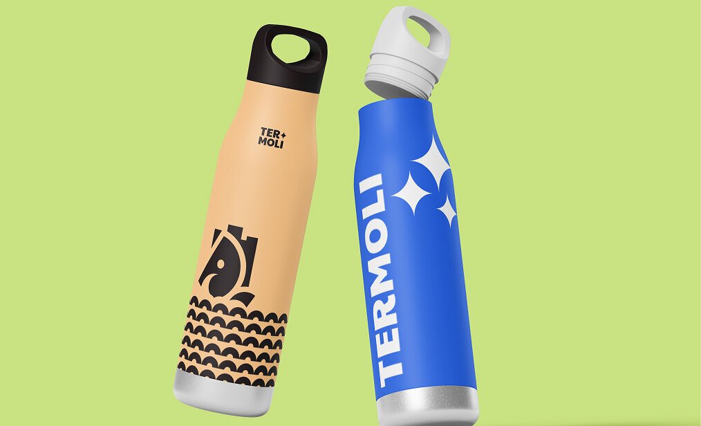
Applications across the city.
From posters and signage to city cards, stamps, and merchandise: the visual system was designed to work at every scale and context, creating a coherent presence throughout the city.