TerraViva competition
ACTIVITIES
- Brand Identity Design
- Logo Design & Development
- Packaging Design
- Label Customization
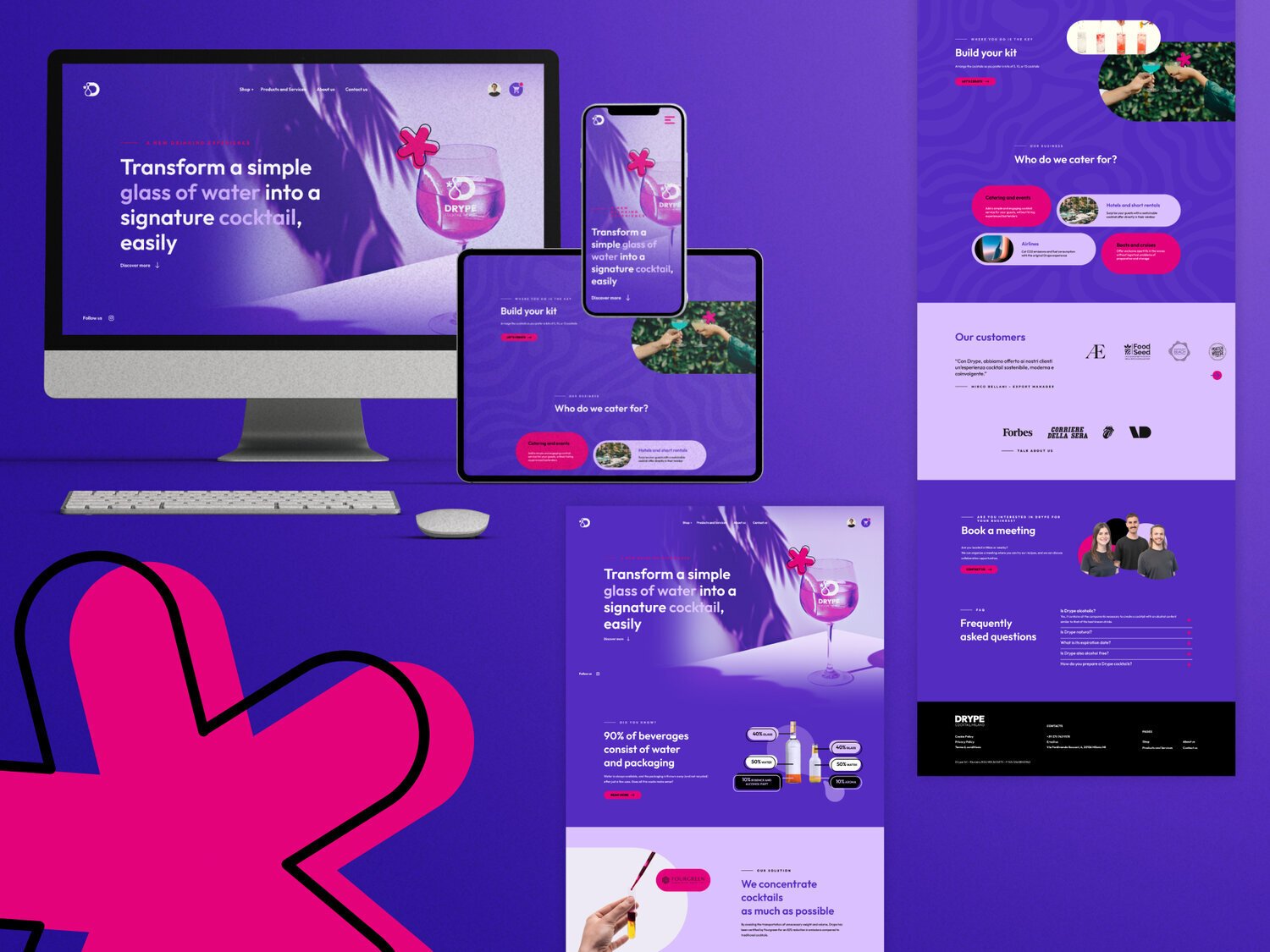
- Website Design & Development
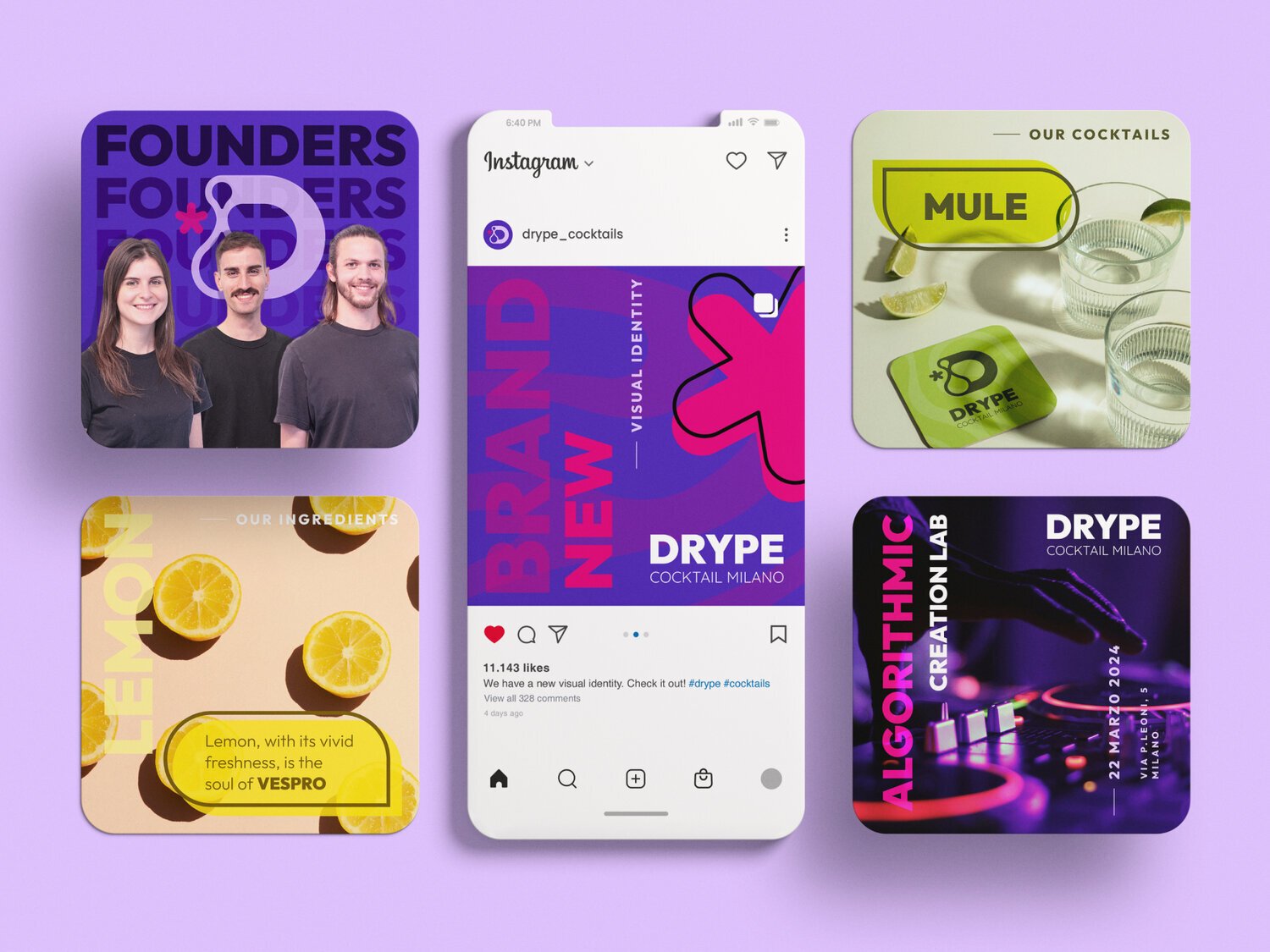
- Social Media Content
DESCRIPTION Drype turns a glass of water into a sustainable cocktail by concentrating cocktail flavours into a small bottle, cutting CO2 emissions and simplifying the logistics chain for bars.
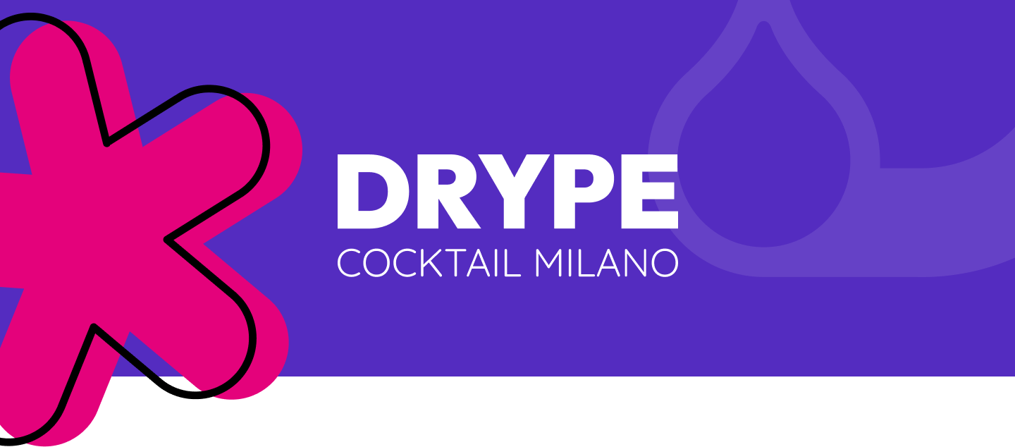
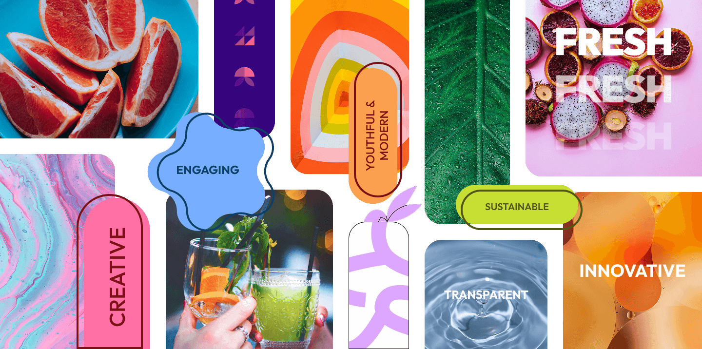
A brand built around a genuinely new idea.
The brief was to build a visual identity that matched the product's ambition: a sustainable drinking experience that doesn't ask people to compromise on taste. The brand needed to feel fresh, modern, and ingredient-led.
We explored the values behind the cocktails: creativity, quality, minimalism, and built a visual language that could carry all of them without feeling overdesigned.
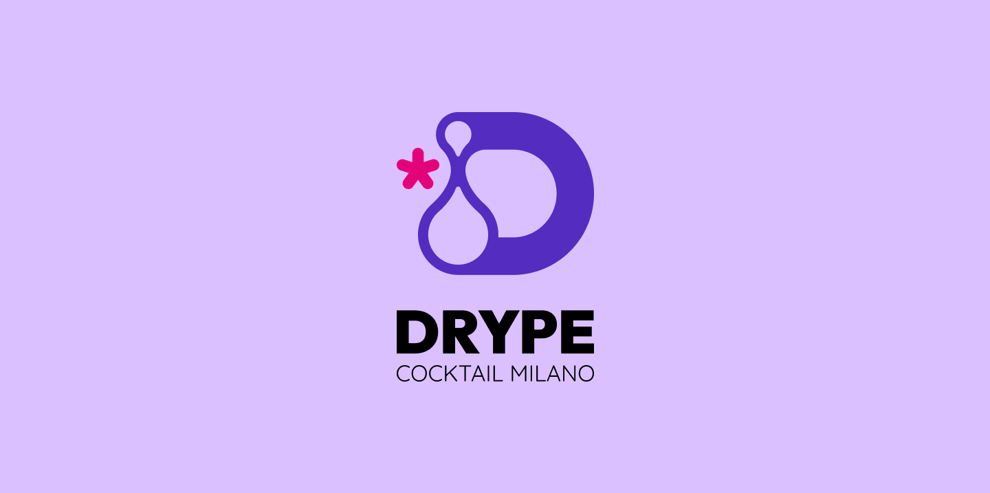
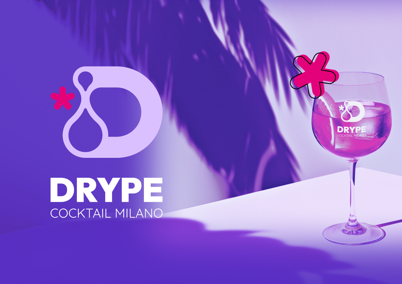
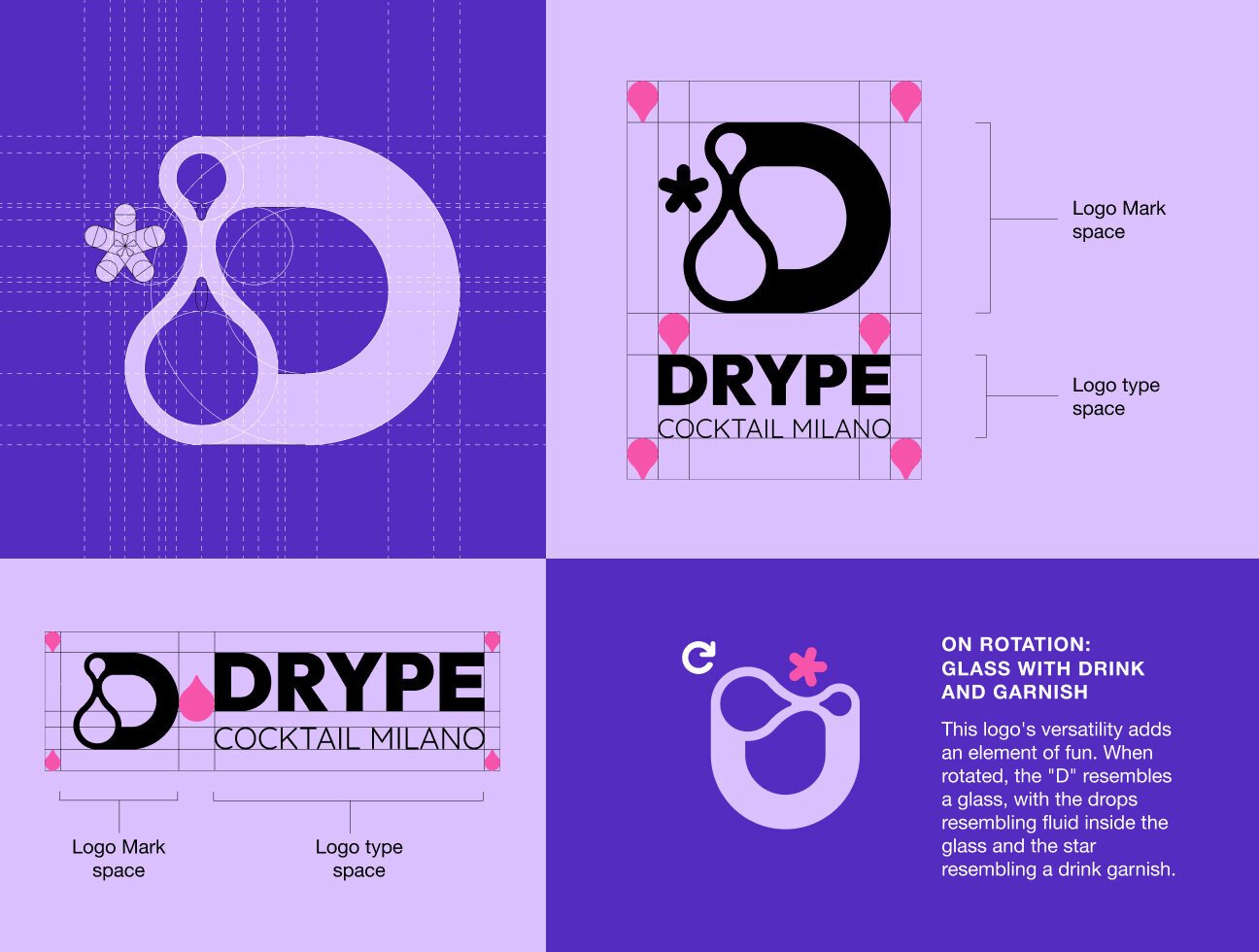
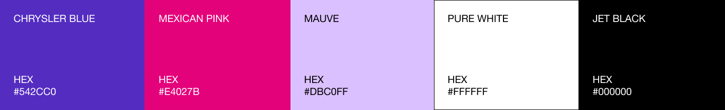
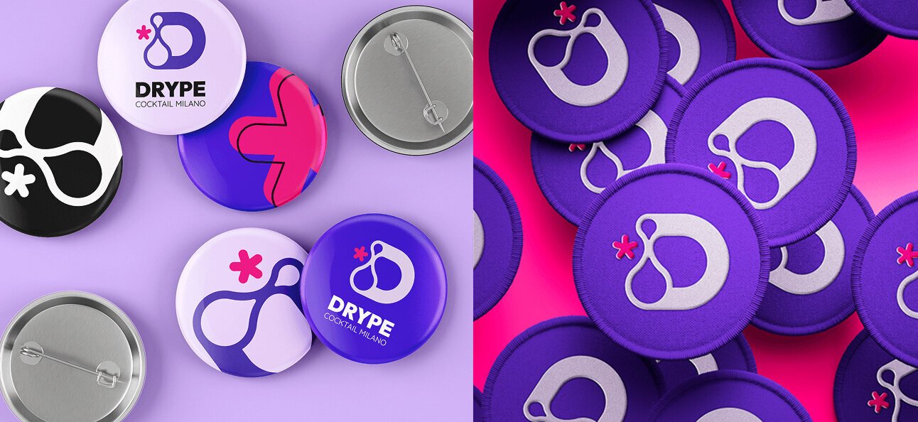
Logo and visual system.
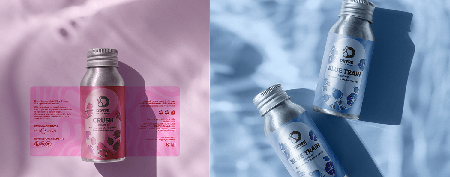
The logo combines fluid, organic shapes representing cocktail flavours with modern geometric elements, creating a youthful and engaging identity that works across bottles, labels, and digital.
The visual system uses vibrant colors and ingredient-inspired illustrations to communicate freshness and transparency at every touchpoint.
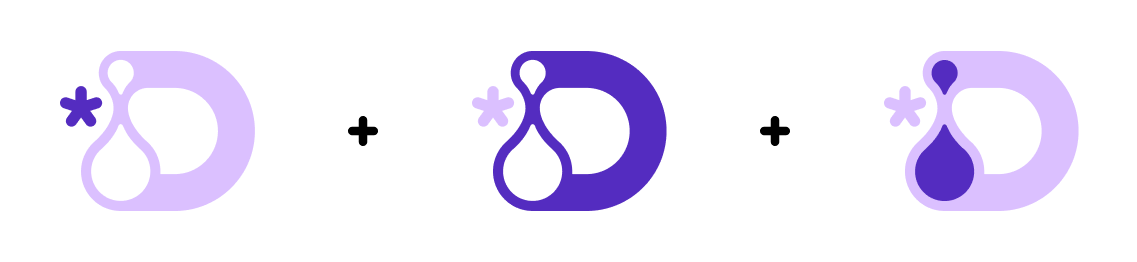
The mark is built from three elements. The letter "D" (drawn in a flowing, rounded style to embody fluidity and a lively character) becomes the container for two negative-space drops of different sizes, representing ingredient quantities and the act of mixing. A small star sits alongside it: for cocktails it signals the alcohol component; for non-alcoholic ranges it shifts to represent the hero mocktail ingredient, keeping the mark adaptable across the full product line.
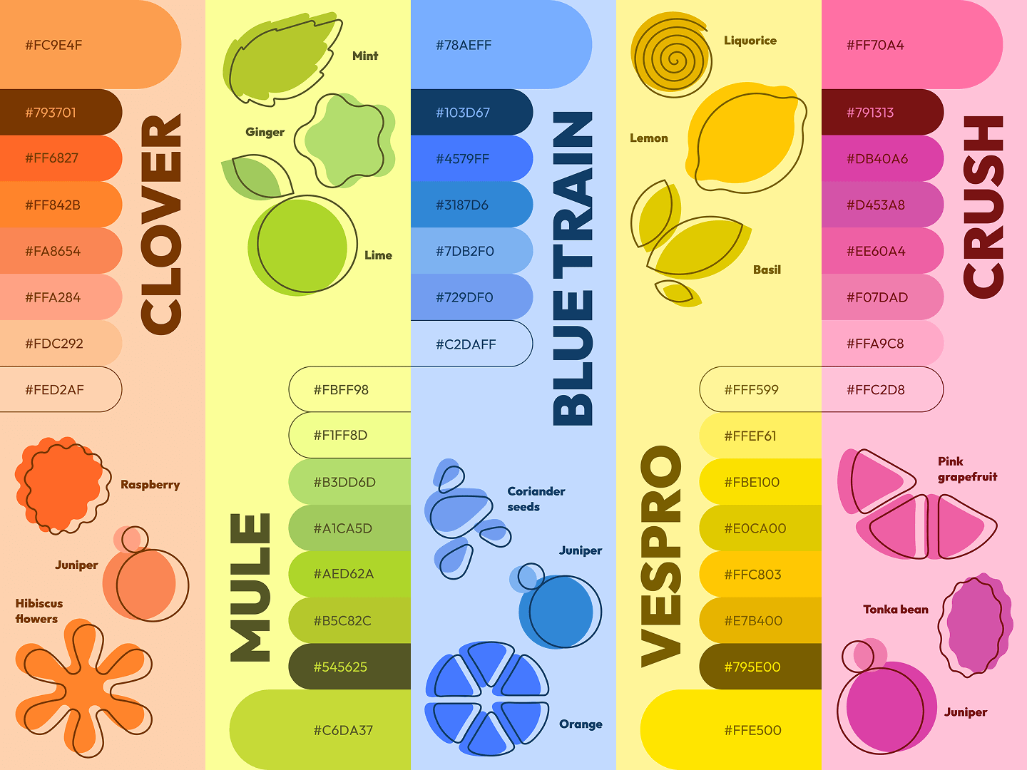
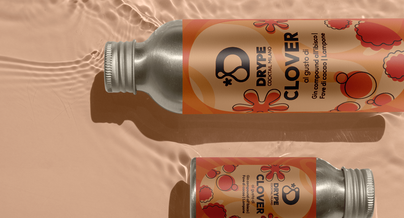
Each flavor has its own palette.
Clover features warm orange tones with raspberry and juniper illustrations. Mule brings fresh greens for ginger, lime, and mint. Every flavor tells its own ingredient story through color and illustration.
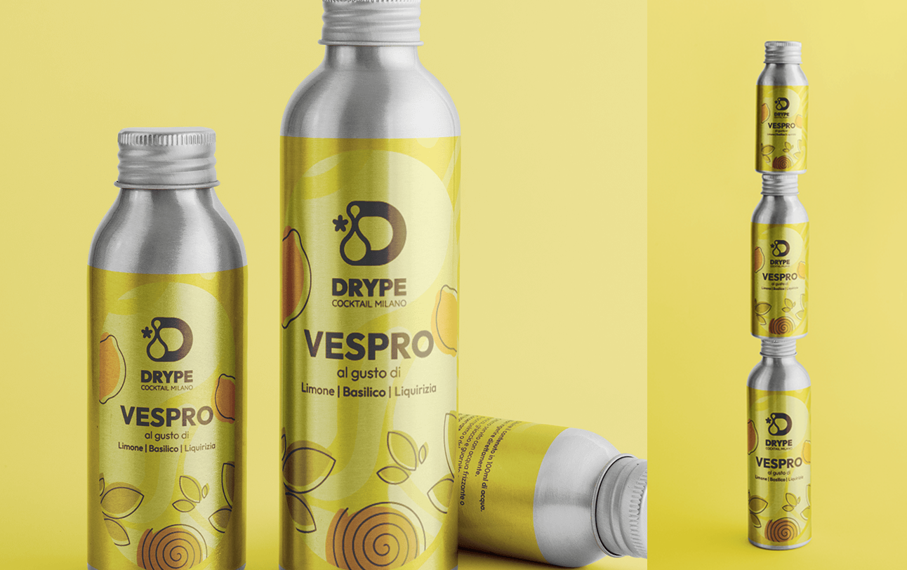
Packaging uses aluminum bottles and minimal graphics, keeping the environmental impact low while maintaining a premium shelf presence.
Labels, packaging, and beyond.
The label system pairs ingredient illustrations with clean typography, making each flavor instantly recognizable while keeping the overall range coherent.
Digital and social.
The website brings the brand's vibrant personality online, making it easy to explore flavors and build custom cocktail kits. Social content uses bold typography and color to keep the feed consistent and recognizable.